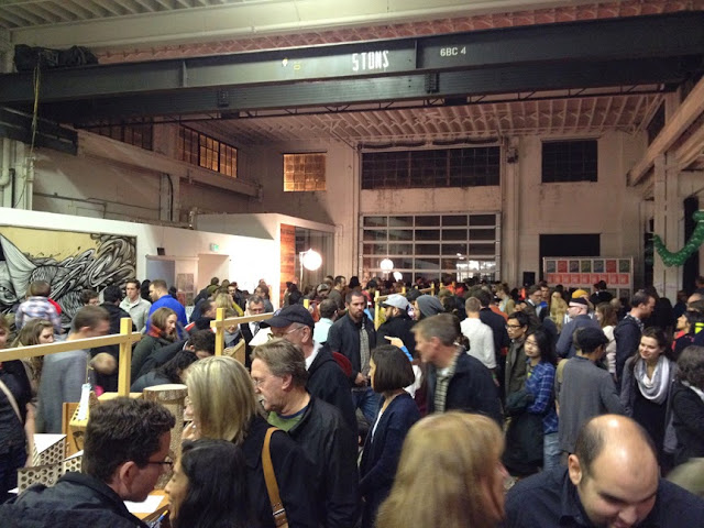
Busy afternoon and evening today, as part of
Design Week PDX!
I watched an excellent
documentary about sign painters at the
Hollywood Theater in the afternoon... Never mind that I got there a half an hour late. There are times when getting late because I feel anxious is really a drag. This film consists of interviews with some old-timers, such as members of the
Letterheads, as well as present sign makers. It was ironic to hear about the 70s as if it were a quasi-Prehistoric very long time ago, the "Golden Age" of sign-making, etc.
On to the
WeMake SketchXchange organized by
Yvonne Perez Emerson. This month's featured speaker was
Nelson Lowry from
LAIKA animation studio… There were over 300 people at this very enjoyable presentation (I was very glad I could attend since I had been wait listed). We saw photos of various stages of sets buildings from
Paranorman, paintings, small models of monsters, etc. I particularly enjoyed the animation figurines on display.
 |
| From Paranorman animation story |
The opportunity to hear an artist talk about his or her work, struggles,
successes, thought processes, etc., is invaluable to people like me.
Creative work is a solitary pursuit, and it is just plain "nice" to be
in a room and to enjoy the openness and willingness of participants to
draw in other people's sketchbooks...
Nelson Lowry drew a little creature in the
small format sketchbook I used for sketch exchanges. However, the space was too big, too noisy and distracting to find anyone to exchange sketches with this time.
 |
| Nelson Lowry |
With nothing else to do for a while, I tried out a
Wacom Intuos Pro tablet… I had never tried one before (the small one I had many years ago does not count because I never used it even once). I liked how it worked, despite the sales rep exclaiming in fake wonder at the results, the same way he probably does for everyone.
…And the day ended with the WeMake
Put a Bird in It party during which very imaginative interpretations of birdhouses made by various designers and creatives were auctioned off.
Two of the birdhouses caught my attention. One had a roof made of peacock feathers and bird feet, but my favorite was the one by illustrator
Rory Phillips, with carefully painted details; it was lovely.
I now wish I had taken more photos of some of the other birdhouses, especially the lucite see-through birdhouse. And a photo of the Beetlejuice-style birdhouse... Or the wood drop birdhouse...
 |
| Rory Phillips birdhouse |
 |
| Baba Yaga inspired |
One of the Design Week-related item that caught my attention was the clever poster for the event. How close can one get to say something without saying it?
And it's funny... how one can ultimately feel alone in a crowd.


